Uni Logo Review
Posted Mon 2nd Aug 2010 Updated Mon 23rd Jan 2017 approx. 1 min read
University of Cumbria

Updated - Tightening things up
A bolder line around the leaves and the a more solid sans-serif makes this a bit more coherent. Still not a fan of the leaves - with the outline it tends to make them a bit clip art like. Seems to a missed opportunity to include a nice pictorial element.
The type is more legible than the previous effort, but it doesn’t feel like there’s a lot of flair in stodgy modern treatment.
Previous Review
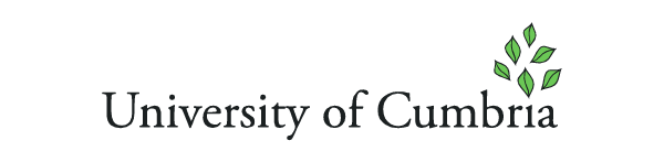
Extremely simple logo consisting of a plain rendering of the University of Cumbria in what looks like a variation of Garamond, with the addition of a set of six leaves in place of the dot over the last i. Reminiscent of a nature related organisation I presume the leaves are a reflection of the very rural character and concerns of the university. Not sure how well it works since there’s no real clue of an educational angle. I couldn’t see if there was any significance in the numbers of leaves (perhaps campuses?).
The leaves themselves have a heavy outline and are angular rather than soft - slightly resembling flames.
A very simple choice of logo attempting to give a sense of the countryside that perhaps could work with a better implementation.
Tagged : English , Serif , Green , Cathederals Group , North East , Nature
Read the Wikipedia entry Visit website