Uni Logo Review
Posted Sun 13th Jun 2010 approx. 1 min read
University of Hull
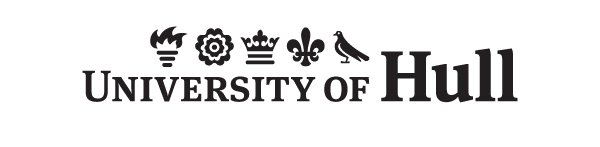
Multiple elements taken from the university crest designed by Sir Algernon Tudor-Craig in 1928. The symbols are the torch for learning, the rose for Yorkshire, the ducal coronet from the arms of the City of Hull, the fleur-de-lys for Lincolnshire and the dove, symbolising peace, from the arms of Thomas Ferens. Such a range of elements signifying such specific things provides a challenge when seeking to refer to a coat of arms, since each must presumably be given equal weight. Hull have tackled this problem by rendering them in a flat style that reminds me of a dingbat font.
The older version of Hull’s logo shown here uses an Egyptian style panel where the elements look like hieroglyphics.
Typography
The strong modern serif of Meta gives some balance between modernity and tradition that suits an established red brick university. A mix of upper and lowercase, prevents the logo becoming too strident, and the serifs are important to distinguish those double l’s.
Notable
Most unusual aspect of this logo is the specific requirement for it to be orientated on it’s side in most cases. The website is considered an exception to this rule, and I’ve shown that version here. It shows an odd attachment to the print media to choose this layout - indeed the examples from the draft corporate guidelines I’ve linked to insist on a whole bar device.
Summary
Nice to see that Hull have eschewed the shield when referencing their coat of arms, but I think the type and the graphic elements don’t compliment each other as well as they could.
Tagged : English , Nature , Crest , Monocolour , Serif , Yorkshire and the Humber
Read the Wikipedia entry Visit website