Uni Logo Review
Posted Mon 13th Sep 2010 Updated Mon 20th Aug 2015 approx. 2 min read
Ulster University

Updated Logo
The brand guidelines are a wealth of info on the new logo, but also the change of name for Ulster. It’s the first time I’ve seen a ‘brand wheel’, though I’m a bit skeptical that someone would have it handy when creating a new piece of communication. Pehaps big stickers distributed around the university?
It’s also fascinating that there’s a lot about the brand proposition and how to communicate it - a development from talking first about the logo. Talking about the message, vision, tone and audiences first sets the context for everything that follows. I like it.
Accompanied by a change of name Ulster have engaged in an endearing bit of retro-futurism by creating an identity that puts me in mind of an optimistic late 60s airline. With clean lines, graceful swooping shapes, vaguely reminiscent of birds contrasted with a bold Helvetica (or similar). I’m a fan of the clean clarity and slightly corporate feel. I love the single sided crossbars on the ‘t’.
The only thing I’m unsure about is if the ‘bird’ part of the ‘U’ is maybe a little far away, feeling a little disconnected. Interestingly, in the stacked, vertical version it seems to be ok flying free.
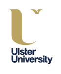
The device works well in plenty of colours, so much so that the gold is one of of my least favourite. That’s a minor quibble with a logo that seems very considered within a branding approach and system.
Also of note are the suggested pre-built graphic devices in the styleguide. Consisting of enlarged sections of the chosen Typeface (FS Matthew Bold). Would be interesting to come back in a few years to see how it worked.
Good to see screen based media examples and suggestions in the guidelines.
Previous Logo

The graphic element of the logo is the combination of two letter U’s interlocking on a background of 3 colours. The U’s are from a srif font, with one smaller than the other. The white one bleeds to the edge of the blue box, making the serifs look almost triangular. The light blue U in the foreground is more intact, but has an odd green patch appended on the top. If there’s some significance to the shapes created by the interlocking and negative space I’m afraid it’s lost on me. It seems overly fussy, and a distracting rendering of two letters.
In contrast, the choice of Optima for university font with it’s large x-height and delicate curves makes for a very open and fresh feel. The combination of colour and font weight make for a nice balance; the ‘Ulster’ is bold without becoming overpowering.
Tagged : Brand Guidelines , Irish , Yellow , Sans-serif , Abstract
Read the Wikipedia entry Visit website Read the brand guidelines