


unilogos Review
Posted Mon 9th Aug 2010 Updated Mon 23rd Jan 2017 approx. 1 min read
Abertay University
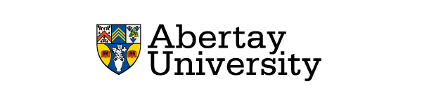
Simple evolution
“We need to make the logo classier”
“I know, let’s add a crest - that usually does the the trick”.
And there you have it - which is a little unfair. The new version doesn’t condense the typeface and is the better for it. It also works pretty well with shield, the tried and trusted method of anchoring the text to something in this sector.
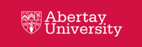
Of note
One detail I thought worked well was the use of an outlined version of the crest on the website, which reversed out of the strong colour used there shows a light touch for something that is repeated across the site.
Previous Review

A typographic only logo from Abertay University, that uses a slab serif face, Serifa to state the basic information simply, with the kind of modern voice that paradoxically, a 1960s can provide. The modern serif is direct, strong and clear. A clear break with the name and crest based logo the university had previously.
There was a quirky characteristic that I noticed - that on some documents the dots over the i’s are absent yet on the website they are present. Which is the definitive logo is unclear. It seems rather an odd thing to do.
Tagged : Blue , Yellow , Scottish , Typographic , Serif
Read the Wikipedia entry Visit website