


unilogos Review
Posted Thu 4th Aug 2011
University of Buckingham
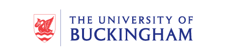
A development from the original design by Franks and Franks, this identity treads the familar path of university logos by a using an inscriptional serif font to boldly declare the location, allied with a plainly drawn illustrative shield.
The sharp serifs on the uppercase text provide some interest in the generous whitespace. Separated from the crest in what seems to be the modern way, by a thin vertical stroke.
The shield itself is a traditional feeling illustration of a swan, alluding, one presumes, to the motto of the university: - “Flying on our own wings”.
Tagged : English , Shield , Uppercase , Serif , Red , South East , Animal
Read the Wikipedia entry Visit website