


unilogos Review
Posted Mon 24th May 2010 Updated Mon 25th Aug 2015 approx. 2 min read
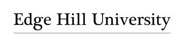
Edge Hill University
Updated
Moving away from the sans serif and windmill to a more conservative and traditional wordmark, it made me think that perhaps many universities are such sprawling organisations with many constituent parts that a simple wordmark is easier to manage and incorporate. In this case it could hardly be much simpler. The wordmark looks like Baskerville, with a subtle change to the bowl of the ‘d’, and a joining of the tail of the ‘g’. Overall it’s readable, traditional if somewhat plain.
One curious element is the thin underline, which is there presumably to provde some kind of boundary for where the logo starts. It’s not objectionable, but feels a little unresolved.
Whilst I was looking for examples of this new logo I discovered these gems showing how far the logo has come for edgehill.
Previous logo

The logo uses an abstract device that with four curved wedges in graduated tones of a greenish blue.
Suggestive of a spiral or perhaps a windmill (which I am informed it’s commonly referred to) , I don’t know of any obvious direct association with Edgehill, though the device does seem to come from a long lineage of basic graphic devices, one of which is a lauburu. Certainly not trying to equate the Edgehill logo with a swastika! - I think I’ll call it a swirl. The colours make it evocative of whirlpool, and as such I provides a pleasant focus for the logotype
Typography
The typography is very much in keeping with a young institution (as a University) and uses what appears to be DIN Mittelshrift - very useful to have those tails on the lowercase L’s. Confident enough to use lowercase and not shout the name.
Notable
Designed by Splinter design studio in 2006 when University status was granted. It moved away from the previous design which used a more literal E. A definite move into abstraction seems to have worked well for Edgehill.
I think i actually prefer the version in use on the website where the swirl is ranged left and more tightly integrated with the text. Viewed smaller it’s more suggestive of some other shapes like a star, or at a push a flower. Would I be stretching things too far to think that it may be a very subtle reference to roses?
Thanks to Mike Nolan from Edgehill for the inside track on what people there call it.
Tagged : English , Monocolour , North West , Serif
Read the Wikipedia entry Visit website