


unilogos Review
Posted Sun 6th Oct 2013 Updated Sun 1st Mar 2018
University of Greenwich
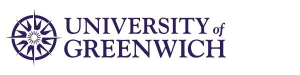
Updated
A tidying up evolution of a pretty solid concept. Seeing the logos next to each other you can see why it’s been done - the new logo is much easier to read and reproduce at small sizes. Not quite so sure about the starburst nature of the new rendering - something a bit more robust for a naval tradition might have been stronger. It’s a little too stylised for my taste, but an improvement on the fussiness of the old mark.
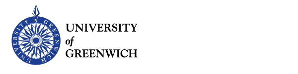
Older Review
The use of an ornate rendering of a compass style pattern makes reference to the thing that Greenwich (the place)is most famous for - GMT. Drawing on the local resource in this way lets the relatively modern university align itself with the rich history of the place.
The Typography is neatly executed upper case reminiscent of more established universities. The lower case ‘of’ provided a nice linkage with the ornate compass face, which makes the the text around the circumference pretty redundant.
Tagged : English , Blue , Uppercase , Serif , London , Circle , Brand Guidelines
Read the Wikipedia entry Visit website Read the brand guidelines