


unilogos Review
Posted Sat 2nd Jul 2016
University of Liverpool
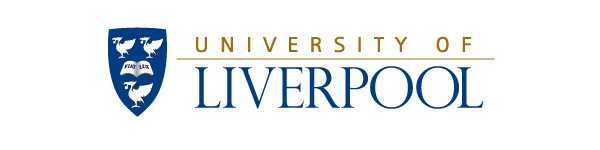
A pretty elegant elongated shield, using the Liver birds so strongly associated with Liverpool, and an open book with the motto ‘Fiat Lux’. The birds are represented in silhouette, making use of their distinctive shapes, but it falls down somewhat with a distracting gradient to make the book more obvious - not sure it’s really needed.
I like the tall uppercase of ‘Liverpool’. It has some nice variation in the strokes, especially evident in those O’s. Not so sure about the spaced out sans serif picked out in gold across the top. It tends to fade away through a combination of the space and the colour - maybe that was the intention. Overall, it doesn’t kill the effectiveness of a well executed traditional style logo.
Tagged : Russell Group , North West , Shield , Blue , Yellow , Animal , The Northern Consortium (NCUK) , Uppercase , N8 Research Parnership , Crest , Red Brick University
Read the Wikipedia entry Visit website