


unilogos Review
Posted Wed 7th Jul 2010 Updated Wed 30th Dec 2018 approx. 3 min read
University of Salford

Updated Review
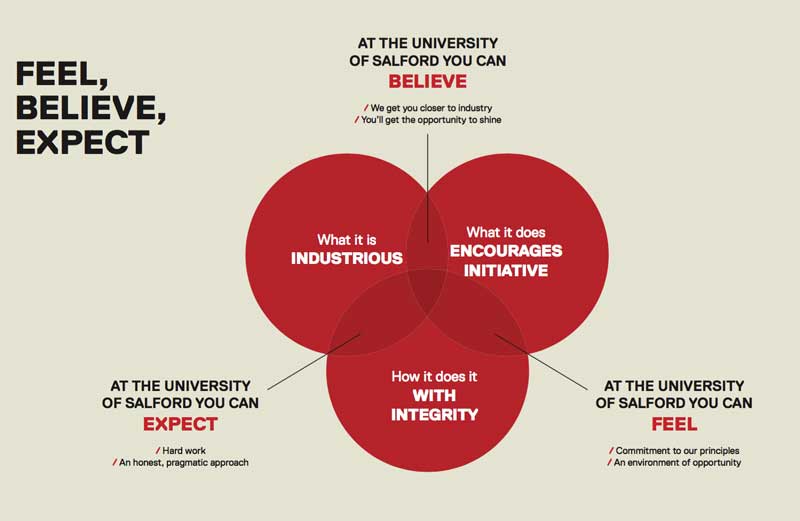
Evolution of the brand accompanied by some jargon heavy marketing speak, talking about what you can Feel, Expect and Believe from the branding exercise. There’s even a superflous Venn diagram. (does anyone ever use Venn diagrams for anything other than nerdy jokes?)
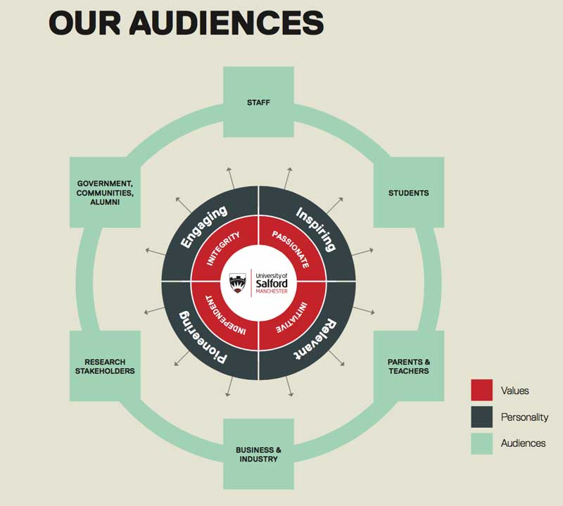
On a personal note I’ve recently been keeping an eye out for diagrams that appear to illustrate something but are in fact pretty pointless; there’s a good example in the brand guidlines, ‘explaining’ all about audiences.
Crest in shield - Achivement unlocked
The tone of the guidelines starts off overly evangelical for what is in essence, a pretty routine addition of elements from the University crest to a logo. Whilst I think it’s good to be clear what you’re trying to achieve some judicious editing to tone it down a bit might have been a good idea. On the the explantaion for the extra elements added to the logo.
“The shield at the centre contains a cog and chain, representing industry and learning.”
A pretty standard rational, but it doesn’t quiet explain the decision to use a section of the crest which creates an illusion of a little explosion happening in the bottom of the shield. I’d maybe believe this was intentional if it’d been mentioned in the guidelines. Overall, as with so many University logos the shield is a safe choice, and it’s kind of cool in a gaming badge way - not sure if that was the effect they were going for though.
Logo Review 2015

Clear, no nonsense but not without some subtlety.
Changing from the animal based, slightly ‘bankish’ previous logo to a more direct and simply stated proposition. Aside from what seems a controversial association with Manchester, provoking some none too flattering coverage, the logo is plain but works well.
Nicely balanced with the different weights and colours providing a simple hierachy.
I couldn’t work out the clean sans serif that is used, but the condensed and slightly square letterforms make for a compact and bold overall device. Whilst looking for the typeface, I came across the the marvellous Salford Type Foundry
Logo Review 2010
Tidying up exercise on Salford’s roundel described in the corporate guidelines. The supporting text around the Lion in a pose called rampant has been made bolder, larger and simpler, whilst also removing some ornamentation. Like the simplicity of just one lion. A strong character in a dynamic pose free of distractions alludes to the history suggested by a coat of arms, without labouring the point. The circular shape is a strong mark when done with simply and with confidence. Was reminded me of the Midland Bank Griffin
The wordmark is in sentence case and set in Frutiger, which adds a light touch to the overall mark. Also nice to see the university happy to be have a less formal feel rather than the more common uppercase.
A calming and fresh choice of green for the wordmark, contrasting nicely with the burgundy of the lion.
Tagged : English , Sans-serif , Brand Guidelines , University Alliance , North West , Red , Typographic , The Northern Consortium (NCUK) , Shield
Read the Wikipedia entry Visit website Read the brand guidelines