Uni Logo Review
Posted Tue 17th Aug 2010 Updated Tue 27th Aug 2015 approx. 2 min read
University of Warwick

Update
A radical change for Warwick, which has been accompanied by what now seems to be a standard response for a University rebrand - a petition and some fairly unflattering comments about the logo.
Described variously, as
like a mid ‘00’s video editing software branding.
like a dance school logo than a symbol of a higher education institution
like a downmarket nightclub
in the comments in this article, however a more considered take on the whole branding process is provided via the petition to halt the branding.
I have to admit I’m a little confused which is the actual official logo. The Gradient filled triangles that seem to be the logo, don’t make an appearance on the website or social media accounts of the University. That confusion doesn’t seem to be an auspicious start for the new identity.
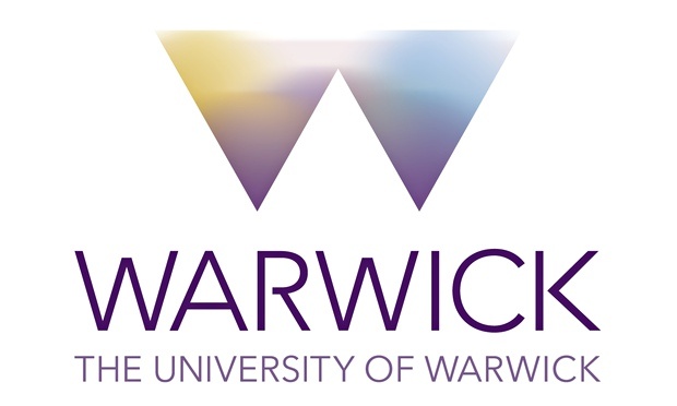
Unlike the article on Underconsideration I quite like the horizontal bar that anchors the ‘w’ device on screens. It seems to me that the logo (the flat version at least) has been designed with a edges of screens in mind and works well as a consistent edge device on the website, though it seems to drop ‘The University of Warwick’ quite quickly from sections of the site. It feels like a sub-brand that works better than the main logo. The ‘logo as window’ trope is also in danger of being overdone.
In the graident heavy version, the triangles feel a little inspid and the type with it’s odd little cut outs and awkwards shapes seems too big. The flat version is much stronger, though overall it feels like they are still struggling to resolve the boldness of the triangles with the practicalities of saying who you are.
Previous logo

Set in what appears to be Trajan Regular for ‘the university of’ and then perhaps a custom variant for the larger Warwick text. The inscriptional font brings to mind all the usual associations of age, experience and tradition. In this case there is a certain liveliness created by the long tail of the R and the very sharp serifs seem to be breaking out at angles.
At smaller sizes some of this liveliness dissipates and one is left with a classical feel and tail of the R underlining the W becomes a more prominent feature.
Tagged : English , West Midlands , Uppercase , Russell Group , M5 Universities , Plateglass University , Abstract , Purple , Sans-serif
Read the Wikipedia entry Visit website