Uni Logo Review
Posted Thu 12th May 2011
Bournemouth University

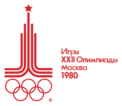
Reminds me of an American college with it’s confident and bold lettering, and the choice to eschew the traditional shields and crests in favour of strong graphic device. An intriguing contrast between the very direct ‘B’ and the more involved and maze-like pattern. A pattern that made the Moscow Olympic logo spring to mind up as an association.

The decision to keep it simply a typographic solution then lends itself (maybe even requires) a variety of ideas and approaches. Some examples are given by the agency that worked on the brand - Radley Yeldar
Tagged : English , University Alliance , South West , Uppercase , Sans-serif , Typographic
Read the Wikipedia entry Visit website