Uni Logo Review
Posted Sun 2nd May 2010 approx. 1 min read
University of Cambridge
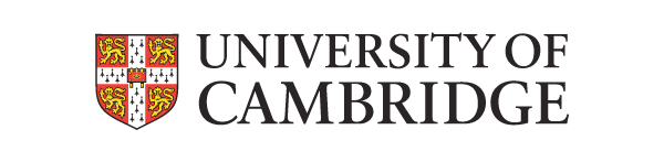
Detailed and traditional rendering of the University shield allied to a straightforward classical treatment for the wordmark.
A good explanation of the shield elements can be found on the Heraldic & Genealogical Society’s website.
The shield is competently drawn and the type is sensibly plain. Rather a special case, being such an influential and widely known brand, the shield cannot really add the to the existing reputation of the University, and functions as visual punctuation. The detail of the shield can be lost, leaving the simples shape of a white cross with central square, and one can just make out the gold lions.
Typography
A mildly condensed uppercase serif wordmark gets the important information across in a traditional, restrained way. No real surprises with the wordmark, perhaps content instead to state the pertinent facts and let the University’s reputation speak for itself.
Interesting grid ideas
An interesting Horizontal grid system is provided in the guidelines, where there are examples given explaining possible uses. The grid specifies the size of the elements that the page should be divided into. For example, an A3 page would be divided into 30 horizontal panels of 20mm each. The system looks pretty versatile, though it relies pretty heavily on the elements being able to occupy the full width of a page for it to work.
Summary
The logo for such a famous and highly ranked University needs to encourage the sense of continuous excellence rather than break any new ground. The extremely understated nature of this logo does this; ironically by being conservative and neutral.
Tagged : English , Crest , Brand Guidelines , Shield , Yellow , Uppercase , Serif , Red , Russell Group , East of England , Science and Engineering South (SES)
Read the Wikipedia entry Visit website Read the brand guidelines