Uni Logo Review
Posted Mon 4th Jul 2016 Updated Mon 19th Mar 2019 approx. 2 min read
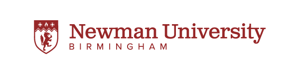
Newman University, Birmingham
Update
What people end up saying about their logos can be funny. On the launch page
“The new logo speaks to Newman University’s past, its place in the present and its hopes for the future. As a modern, diverse and inclusive institution we want to celebrate where we have come from but continue to emphasise that the light of learning remains at our core and that, like the rampant wolf, we should be noble and courageous in pursuit of this.”
Yeah, everyone thinks of wolves as nobly pursuing the light of learning - not a stretch at all.
It’s a shame such guff is thrown around this (and it’s by no means the worst I’ve read) because this is a rather nice upgrade and huge improvement on the previous abombination. The shield is nicely proportioned, all the elements clearly drawn and the zig-zag add some zing. Added to what looks like Clarendon the text is a strong compliment to the shield - I think more Universities would make more of their shield fetish with some slab serifs rather than the usual classical serifs.
Old Review

A very curious mish mash of effects and ideas are evident on this odd effort.
I’m at a loss to understand what the radial gradients in the leaf shapes are trying to achieve. Perhaps some nostalgia for the early nineties when people discovered the horrors they could create with gradients? The existence of the a red one is also inexplicable. I have to confess that I could only see the ‘leaves’ until I saw this black and white version of the logo.

and now I see the cross - which makes sense the college has a religious background. There’s certainly no disputing that the cross is a much stronger visual device, so why destroy it with gradients?
The other component of the logo is the type which is at least consistent in it’s bizarre combinations. Those radial gradients return in filling in some very awkward letters, which seem to be attempting to echo the leaf shapes. If you imagine typography as a tone of voice of a brand, it’s difficult to discern what this might be.
A low end, new age health clinic perhaps?
All very confusing.
Tagged : West Midlands , Cathederals Group , Red , Shield , Serif , Animal
Read the Wikipedia entry Visit website