Uni Logo Review
Posted Fri 3rd Sep 2010 Updated Fri 14th Nov 2017 approx. 1 min read
University of Northampton

Updated
The new Northampton logo is a big departure from the previous one (below). Giving up on the pictorial shield full of obscure local references, they’ve instead gone for a purely tyopgraphic solution. The ‘U’, ‘O’ and N’ are certainly very bold, but unfortunately my brain keeps trying to spell out the word ‘Uno’ rather than intended U-o-N. The supporting text is really needed (as is the case with most University logos), which give it a feel of a partially realised idea. I can see how it might work integrated across campaigns and media, but feels a bit thin on it’s own.
Older Review

The Northampton logo has an interesting approach, explained with this diagram from the corporate guidelines.
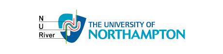
As you can see an attempt has been made to incorporate a few elements and meanings into the logo, it only really works if the letters function as letters first and foremost. Good idea to incorporate a graphic based obliquely on something important and relevant to the town, but trying to mangle the letters ‘n’ and ‘u’ into a pre-existing shape seems a step too far.
It could be that I’m staying up too late but I see a stylised rabbit somewhere in there. The badge shape is however, a nice variation on the traditional shield, and hints at what could be done with this logo. The ‘u’ shape makes the logo feel unresolved.
On the plus side, I Like the choice of optima as a clean and softer modern font. Tightly spaced but still managing to be fresh and open without trying too hard to be dynamic and aspirational. The decision to set it all in uppercase makes alignment easy negating any awkward whitespace within the word.
Tagged : English , Sans-serif , Million + , Typographic , East Midlands , Blue , Uppercase
Read the Wikipedia entry Visit website