Uni Logo Review
Posted Tue 11th May 2010 approx. 1 min read
University of Reading

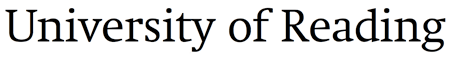
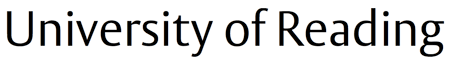
The reading logo uses the familiar motif of a shield and the coat of arms has a longer lineage than I was originally aware of Small touches of modern tastes have led to the shield accquiring some subtle softening of the corners. The wordmark of the logo uses the university sans serif, complete with the long straight extender? of the ‘R’ which is used as a graphic device elswehere.
Typography
In a development befitting an institution with a long estabished tradition of typography the university uses two bespoke typefaces and then makes them available for staff to use.
‘Rdg Swift’ is a fairly quirky serif face, with some hefty wedge shaped terminals and serifs, set off by a large x-height.
‘Rdg Vesta’ is a reasonably narrow face with some tapered elements, reminding me of a compressed optima.
Together these faces are used extensively, providing a range of options and the idea of providing easy and practical steps for anyone to acquire the fonts might make the task of enforcing the brand a more manageable one.
The simple mark makes for a confident and relaxed logo. The subtle softening of the shield is in keeping with the typography, which seeks to speak in a confidently modern way.
Tagged : English , Crest , Sans-serif , Brand Guidelines , Shield , Red , South East , Yellow
Read the Wikipedia entry Visit website Read the brand guidelines