Uni Logo Review
Posted Tue 6th Jul 2010 Updated Tue 11th Aug 2015 approx. 1 min read
Robert Gordon University
Updated
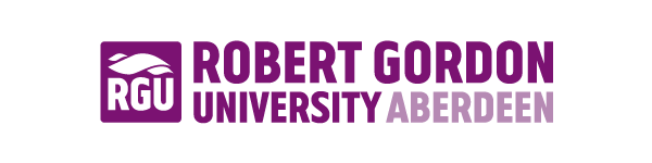
Evolution more than revolution for the RGU logo. In this case the revolution means shedding the vaguely starbucks-like roundel, and radically simplifying to initials and what I assume are meant to be mountains, or maybe waves. It’s not as subtle as the old one - which itself was pretty bold. I wonder if the emphasis on the ‘RGU’ is a sign of intent to push the shortened brand. Perhaps a way to acknowledge that brands have to live on screens as well as other media.
Older review
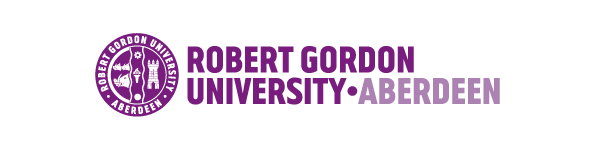
The following areas were identified in the corporate guidelines, outlining the rationale for the changes to the name and the logo.
- Increased prominence given to our locatIon
- Removal of the definitive article
- Increased legibility of our coat of arms elements
- Application of a new corporate colour to help distinguish our identity
I particularly like the very strong roundel where the parts of the University coat of arms have been brought together in a monochrome diagram that reminds me a little of a sporting badge. This feel is created by the strong uppercase around the imagery. The bespoke font (called Gordon) are is a compressed sans-serif that works well in the confines of the circle. The Os and Ds reminded me of DIN Mittelschrift and when “looking at the DIN variations one can see it’s almost a combination of both.
The purple is also a welcome break with the usual blues and reds the seem prevalent in the sector.
Overall, a nice tension between the commonplace crest imagery with a subtly dynamic and strong display typeface makes this an enjoyable and distinctive treatment.
Tagged : Sans-serif , Uppercase , Scottish , Purple , Abstract
Read the Wikipedia entry Visit website