Uni Logo Review
Posted Mon 5th Jul 2010 approx. 1 min read
University of East Anglia

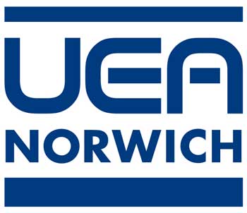
Set in a classical uppercase serif, the letters UEA are broken up in an almost stencil like way. The glint/spark completes the cross of the A creating an overall feel of a rather austere and technocratic feel. It reminded me of the NATO identity, and a quick search suggested others. The glint or spark from the logo is permitted to be used as a separate design element described thus
It captures an iconic representation of the creative ‘spark’ or ‘glint’ which epitomises much of our work, whilst also communicating as a mark of excellence.
A method of integrating Faculty and Department names with the logo is also suggested:
Logos with descriptors are made by adding either one, two or three lines of copy to the UEA logo. In order to establish a hierarchy for the descriptor Gotham Medium is always used for the first line, Gotham Book for the second and Gotham Book Italic for the third line.
The choice of Gotham is a good one; it’s a very open and airy font with a confident modernity. When present perhaps the idea is to balance the sharpness of the main logo in this way.
Summary
An interesting typographic exercise with negative space the sharp logo is a big contrast with the previous UEA logo, shown below, which evokes a late 60s futuristic vision and was distinctive in it’s simplicity and boldness. Perhaps indicative of the university seeking a repositioning away from it’s 60s roots, the new one strikes me as a touch on the delicate side in comparison.

Tagged : English , Blue , East of England , Plateglass University , Eastern Academic Research Consortium , Typographic , Serif
Read the Wikipedia entry Visit website